
Menu navigation is popular mobile apps, where screen real estate is at a premium. Traditional navigation like tree menus, dropdown menus and button tabs can quickly clutter smaller screens and reduce the available space for content.
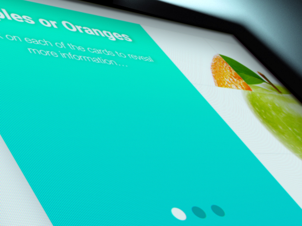
While most course designs are large enough to display full menu navigation, there are some design benefits to collapsing the navigation to create a clean and uncluttered slide.
Let’s explore at a few examples that we have used in the past.
This menu design uses micro interactions (animations) to show the user where they are at any time.

Whereas this menu uses a fullscreen overlay to display the menu along with micro interaction rotate animation just to guide the users eye.
Finally, this in this menu we use the same overlay effect, but use animations to covey the change in function of the buttons.
Menu design is very important in a course, as it should let the user jump to other parts of the course, but a good menu will also let the user know where they are at any time.